
Nurture
Overview
The gap of communication between teachers, parents, and administrators creates a complex, inefficient, and frustrating experience. Today’s childcare management systems don’t do enough to address these issues by being challenging to administer, difficult to use, and hard to navigate.
Nurture is a childcare management system designed to minimize complexity and empower caregivers by streamlining administrative processes and breaking communication barriers so parents stay informed, schools can spend more time supervising, and staff can place their focus where it belongs; on the kids.
Timeline
Oct 2023 - Jan 2024
My Role
Flow Optimization App UX/UI Design Scheduling Design


Nurture
Overview
The gap of communication between teachers, parents, and administrators creates a complex, inefficient, and frustrating experience. Today’s childcare management systems don’t do enough to address these issues by being challenging to administer, difficult to use, and hard to navigate.
Nurture is a childcare management system designed to minimize complexity and empower caregivers by streamlining administrative processes and breaking communication barriers so parents stay informed, schools can spend more time supervising, and staff can place their focus where it belongs; on the kids.
Timeline
Oct 2023 - Jan 2024
My Role
Flow Optimization App UX/UI Design Scheduling Design
Flow Optimization
First, I needed to understand current user flows as this application focuses on 3 different individuals: Parents, Teachers, and Directors. These personas utilize different parts of Nurture which are the Entrance App, Parent App, Teacher App, and Directors Portal.
With lots of moving parts, I first laid out a map to visually show me the overall flow, and then dove deeper into each application so I understood the goals of the individuals and could address the requirements from each group and app. Our team gathered feedback from multiple schools using Nurture and we compiled the asks into a list to review. After discussion and refinement, from there we had a detailed list of requirements and updates to make.
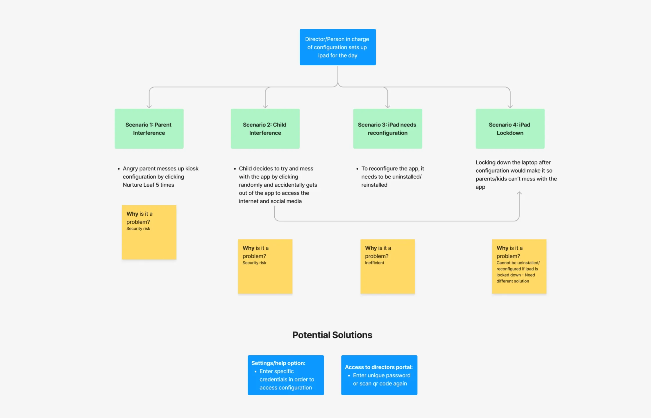
To simplify the Entrance-to-Teacher App flow, we first identified the scenarios in which the app will be used since all of our primary users interact with the app.
App UX/UI Design
In order to keep things efficient, we began the creative stage by transitioning to using the Material 3 Design Library. Looking at the current UI, there was quite a few areas for improvement such as accessible color combinations, design of the components, and iconography. We also simplified the Entrance-to-Teacher App flow while also solving critical security issues, and developed the look and functionality of the scheduling feature of the Director’s Portal.
Once the tablet is configured to a class, it can be accessed by parents and staff. The staff use this app to clock in and out for the day. The current flow had no clear hierarchy making it difficult to navigate. We cleaned this up by shrinking things down and updating the colors of the clock in and out options to make it clear to the user what they are doing.
The flow for the parents also went through lots of iteration. The main problem was navigating the scenario in which a parent needed to check a child in and out at the same time. We experimented with status chips and color coding, however things got confusing quick with these options. In the end, we decided the best approach would be to contain the child’s status in the same card with the same color. When a child is selected, their status changes to the action that will happen EX: Child is checked in, parent clicks on them, status changes to “Checking out”

Scheduling
The goal of staff scheduling in the Directors Portal is to see at a glance what classes teachers are scheduled in at what times, and solve conflicts such as if a teacher gets double booked or a class does not meet the required teacher-to-child ratio.
All of the classes within a school had to be shown on the same page. I organized them into dropdowns so that directors could see multiple classes while collapsing others to make for easier viewing. Once a class is opened, the director can see all of the children’s schedules, the teachers, the student-to-teacher ratio, and any conflicts that are present. Since there is a lot of information being presented at once, I decided to color code them so the director can process quicker what is being shown, then see the finer details with the times within the blocks.
To resolve a conflict, or if they want to alter the block at all, they simply click on it and a pop up appears with the different options according to the block type.
Directors can go even further with staff scheduling by clicking on the teacher bringing them to a detailed view of their weekly schedule where they can alter times for the current week as well as set their schedules for future weeks.

Final Thoughts
By prioritizing user needs and incorporating feedback at each stage of the design process, we have created a product that resonates with our target audience and fulfills their requirements effectively. Moving forward, it is essential to continue gathering user feedback and iterating on our designs to maintain usability. By remaining agile and responsive to evolving user needs and market trends, we can ensure the long-term success and sustainability of our solutions. By placing the user at the center of the design process, we can create experiences that delight, engage, and empower users, ultimately driving success for both our users and Nurture as a platform.


